
Amazon Delivery Experience
Checkout improvements

The short version
The deets
Role: UX Lead (remote)
Skills: Information architecture
Scope: All consumer orders with more than one delivery worldwide
Duration: July 2020 - Jan. 2021
Result: Multiple modular components able to move forward
The backstory
The Delivery Experience team (DEX) manages all communication with Amazon customers world wide regarding receiving or picking up items from product search to final delivery status. My role on the team was UX Lead for consolidated, scheduled, and sustainable delivery choices.
What's the problem?
The checkout page was already difficult for large/complex orders and was getting worse as more teams wanted to add features.
Information density and repetition
Excessively long and poorly organized for multiple shipments
Key information missing from glance view
Poor engagement below the fold
Poorly rated against competitors
Priorities not aligned with new business initiatives
Where I come in…
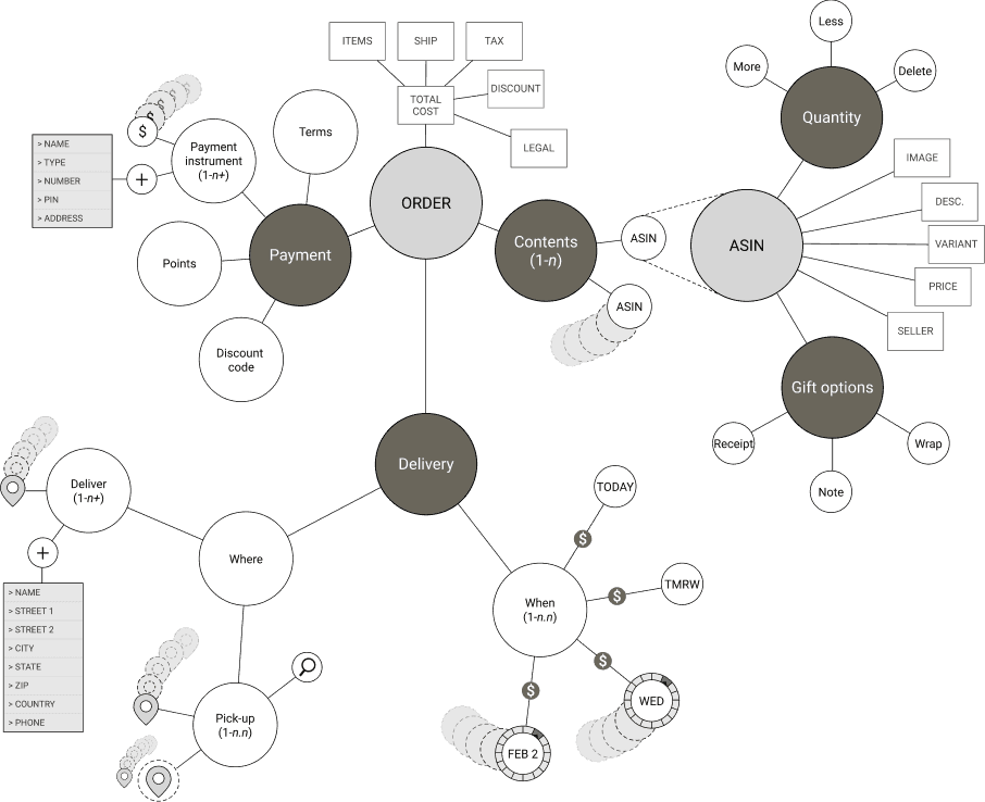
This was my initiative. From my perspective working on different smaller projects, I could see we needed to take a step back and look at things more holistically. I compiled heuristic evaluations, metrics on engagement and scroll depth, 3rd party analysis, and a summary of upcoming initiatives that would impact customer experience in order to frame the problems for stakeholders.

What I did…
Due to competing priorities, collaboration with others was severely limited. In order to move things forward, I sketched a wide range of options to vet ideas and collect feedback. I took the most viable options to high fidelity prototypes and ran usability studies against our current checkout flow.
Principles and goals:
Lead with where, when, and how much
Ensure customers see when defaults are applied or changed
Condense length of page ("semantic zoom" approach)
Promote consolidation and sustainable delivery

How it worked out…
The prototypes tested well, but we're conservative with changes to key pages like checkout. I was able to break the changes down into smaller parts for implementation. We were blocked on doing anything at the time due to a platform migration, so the work was handed off when I left to join a new team.

The takeaway
I'm glad I had this chance to identify an opportunity and run with it. While my process was far from perfect, I was able to surface the problems and drive important discussions as well as provide the templates for multiple small improvements. By socializing this work I also drew attention to the poor communication and mismatched goals between DEX and Core Shopping and was asked to take a lead role in improving synergy between the teams.